Excel Training: Sparkline Charts
The sparkline chart is a miniature chart inserted directly into a cell.
The purpose of a sparkline chart is to provide a visual representation of the data in a row (or column) as a chart.
Insert a sparkline chart
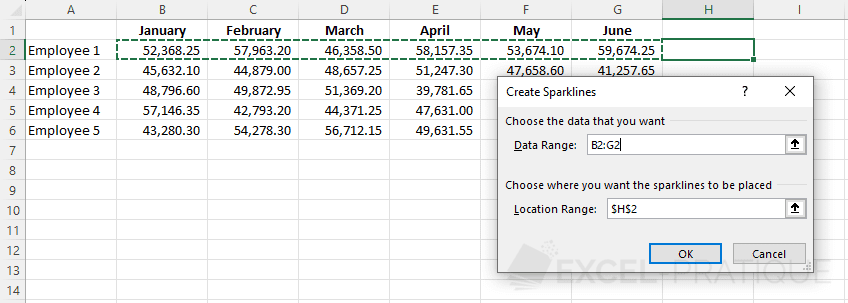
To add a chart to the right of the following table (lesson-7b.xlsx), click on the "Insert" tab and choose one of the 3 proposed sparkline chart types.
Start by inserting a "Line" sparkline chart:

Select the chart's data row and validate:
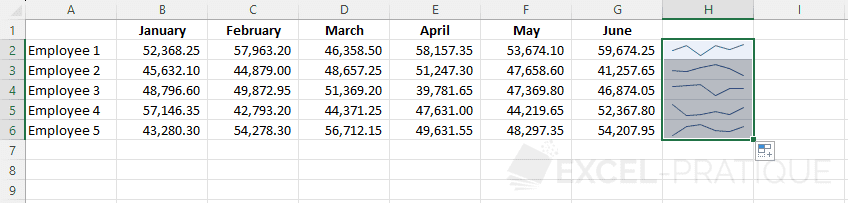
Then copy the chart downwards:
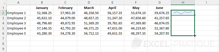
To obtain:
Customize the sparkline chart
You can customize the appearance of the charts from the "Design" tab:

You can also change the chart type from this tab:

To highlight certain points of the chart, check the points to display and if necessary modify their color, like here with the display of the "High Point" in green:

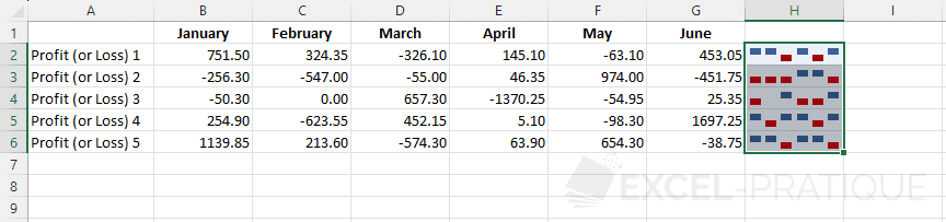
The "Win/Loss" sparkline chart
This last type of chart is more simplistic and allows only to visualize if the values are positive or negative: